kumo.productions™ Branding StandardsVersion 1.0
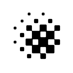
The kumo™ Symbol CENTRAL

kumo.productions™
Branding Standards

Created
December 24, 2024
Version
1.0

General rules

This document sets out the minimum rules required to preserve the kumo.productions™ brand when using the logotype, together with reference examples of its use. Apart from the prohibitions explicitly defined here, treat all other general items as guidance, and apply them with appropriate judgment for the medium and situation. Should new media or technologies cause these rules to hinder the preservation or use of the brand, they will be revised promptly in consultation with the owner of this document.

Designers working with the brand under these guidelines should not feel constrained by the rules in this document — produce the graphics that best serve the final result.

kumo.productions™ is a video production company based in Tokyo. kumo™ specializes in motion graphics and 3D CGI, and has been creating commercials, music videos, and live performances.

Contents

The kumo.productions™ Naming Guidelines

02

Naming & Notation

Official name and notation

Info
The legal name of the organization is 合同会社クモ・プロダクションズ (English notation: kumo.productions, Inc.).

Primary

The official name and notation of kumo.productions™ is kumo.productions™. As a rule, do not put a space between productions and ; however, when a space makes the text resolve as a hyperlink and that benefit matters, the space may be inserted.

Example: posting on social media
kumo.productions™ → does not become a link
kumo.productions ™ → becomes a link
See also → URL notation

Secondary

In environments where cannot be entered, write kumo.productions. Where . cannot be used either, write kumoproductions.

Do

  • kumo.productions™preferred
  • kumo.productionsdomain names and other environments without ™
  • kumoproductionsusernames and other environments without ™ or the period

Don't

  • Kumo Productionsnever capitalize
  • kumo プロダクションnever render the name in Japanese
  • kumo_productionsnever use underscores

Short name

kumo™ may be used as the short name. Use it mainly within sentences, and avoid standalone use elsewhere as much as possible.

e.g. In sentences
kumo™ is a video production company in Tokyo.
This work was produced by kumo™.

kumo may also be added to file names and similar identifiers to indicate ownership or management by kumo™. Write it in all lowercase or all uppercase, unaffected by any surrounding naming convention.

Do

  • kumo_Logo.pngfile name
  • KUMO-HNDhost name

Don't

  • Kumo_Logo.pngnever use PascalCase

URL notation

The domain name is kumo.productions. Unlike .com and the like, the .productions TLD is uncommon, and a bare domain is not obviously a URL at a glance — take care.

Especially in print and other situations where a hyperlink is not possible, prefer writing the URL with an explicit marker, as follows.

  1. 1. https://kumo.productions/state https:// explicitly
  2. 2. 🔗 kumo.productionsuse an icon
  3. 3. Web: kumo.productionsprefix with Web: or similar

The kumo.productions™ Symbol Guidelines

03

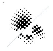
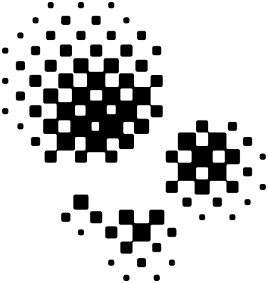
The kumo™ Symbol — CENTRAL

The base composition of the symbol

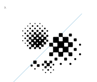
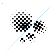
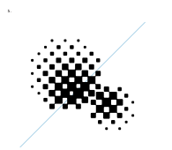
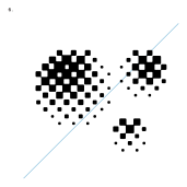
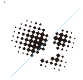
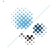
This symbol is the most fundamental element of the visual identity. It is composed of four spheres of different sizes, arranged on the prescribed grid.

Its silhouette — a cloud, and the gathering of water droplets the name evokes — embodies the many elements of computer-graphics production at kumo.productions™: materials, shading and lighting, compositing, pixels, and motion. It symbolizes that expressive range while remaining flexible enough to adapt to any medium or environment, and it retains its identity in any composition.

Only the pattern, proportions, and tonal values of the individual spheres carry the visual identity of kumo.productions™; their individual layout and number do not affect it.

This is the most basic of those layouts, and every kumo.productions™ identity is symbolized around this composition.

Unless there is a specific context or intent that calls for transforming the spheres, we recommend using this as the base composition.

The kumo™ Symbol CENTRAL
symbol-central.svg
SVG ↓

The kumo.productions™ Symbol Guidelines

04

The kumo™ Symbol — Systems

Construction system

The symbol is composed of four spheres of different sizes, each of which is in turn built from particles that express its shading.
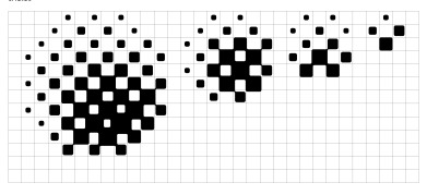
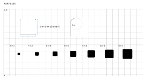
SPHERESFour sizes, 11, 7, 5, and 3 grid cells in diameter. Within a single symbol, each size may be used at most once.
PARTICLESThe particles that make up each sphere use seven object sizes to express its shading.
PremiseLet one side of the grid be 15a.
1.Composed of seven squares with sides of 3a(n+1) (1≤n≤7, where n is a natural number),
2.with every corner rounded at a radius of 2a.
3.Place them on a grid of 15a squares, always along the diagonal.
Construct the connections between particles as follows.
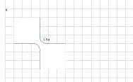
4.Connections are built with a fillet radius of 1.5a.
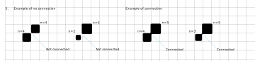
5.Whenever a particle of size 5≤n is diagonally adjacent to one of size 3≤n, they must be connected.
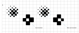
6.As an exception, a particle on the outer edge may connect to just one adjacent particle.
SPHERES base compositions
SPHERES — 11 / 7 / 5 / 3, 4, 7Composed of four sizes: 11, 7, 5, and 3 grid cells in diameter.
PARTICLES size specification
1. 2. PARTICLES — 3a+3an (1≤n≤7) / 2aSeven squares with sides of 3a(n+1) (1≤n≤7). Every corner is rounded at a radius of 2a.
Connection fillet radius 1.5a
3. 4. 15a / 1.5aPlaced on a grid of 15a squares, always along the diagonal. Connections use a 1.5a fillet radius.
Connected and not connected judgments
5. Example of no connection / Example of connection — 5≦n / 3≦nWhenever a particle of size 5≤n is diagonally adjacent to one of size 3≤n, they must be connected.
Connection examples in composition
6. Connected / Not connectedAs an exception, a particle on the outer edge may connect to just one adjacent particle.

Composition examples 1–6

The symbol is composed of four differently sized spheres arranged on the prescribed grid. Only their pattern, proportions, and tonal values define the identity — their individual layout may be arranged freely within the following rules.
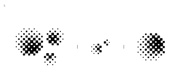
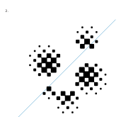
Composition system 1 — scale range
1. A composition that does not use every sphere still counts as the symbol; there are no special restrictions on which spheres to use.
Composition system 2
2. However, spheres of the same size must not appear more than once within a single identity.
Composition system 3
3. Do not change the size or proportions of individual spheres within a single identity.
Composition system 4
4. Spheres that form a single identity must be placed on the same grid.
Composition system 5
5. The patterns of adjacent spheres must align, with every particle positioned along the 45-degree diagonal.
Composition system 6
6. Shading must assume a single light source, or the direction of shading must converge on a single point.

Corner ornament

A treatment that uses a single sphere as an ornament, as seen on kumo.productions™ OGP images and at the top of web pages. In addition to the construction rules above, follow the rules below. This portal applies it at the top right of the page.

1.A single sphere may be placed in the top-right corner of a surface, partially cropped (bled off) by the top or right edge.
2.Use one of the four defined spheres on its own; horizontal mirroring is allowed. Rotation is limited to right angles relative to the medium.
3.Use at most one ornament per surface, and never overlap it with the logotype or body text.
4.Color it as a single flat fill following the Color Style rules, keeping sufficient contrast with the background.
OGP 1200×630 — sphere_3 mirrored / top-right bleed

The kumo.productions™ Symbol Guidelines

05

The kumo™ Symbol — Incorrect Usage

Prohibited examples

Never deform or distort the symbol beyond its prescribed proportions. Beyond the examples below, any treatment that significantly damages the brand identity is prohibited.
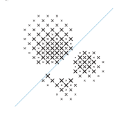
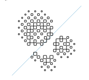
Incorrect: replaced particle shapes
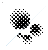
1. Do not use fills that blend into the background and significantly impair recognition of the shape. Temporary states within video footage are exempt.
Incorrect: outlined
2. Do not render the symbol as outlines.
Incorrect: rotated particles
3. Do not add cast shadows extending from the symbol or render it partially outlined.
Incorrect: skewed
4. Do not deform or distort beyond the prescribed proportions. When displayed on a three-dimensional object, this is acceptable only if the treatment does not significantly impair recognition of the shape.
Incorrect: irregular shapes
5. Do not place the symbol at any angle other than horizontal or perpendicular relative to the medium.
Incorrect: off-palette colors
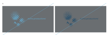
6. Do not use multiple colors across the individual spheres of a single identity.

The kumo.productions™ Logotype Guidelines

06

The kumo™ Logotype

Logotype — Pangram Pangram Foundry / Object Sans Regular

The logotype is the most fundamental element that visually represents kumo.productions™.

Built on Object Sans Regular by Pangram Pangram Foundry, it permeates and adapts to every context while embodying the identity at its most iconic.

Each of these logotypes is a fundamental element of the kumo.productions™ visual identity. Use the appropriate variant for the medium and the design of the graphic.

Never deform, rotate, or redraw the logotype in any circumstance. Changing the color or density of individual objects is also prohibited, apart from a few defined exceptions.

Always use an exact copy taken from this document or the accompanying logo data.

When multiple symbols are visible at once on a single surface of one medium, avoid layouts that repeat the same size and shape as a rule.

Three-dimensional objects are exempt from this rule.

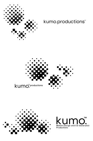
The kumo™ Logotype PRIMARY

kumo.productions™ logotype PRIMARY with TM
logotype-primary-tm.svg
SVG ↓

The kumo™ Logotype SECONDARY

kumo.™ productions logotype SECONDARY with TM
logotype-secondary-tm.svg
SVG ↓

The kumo™ Logotype TERTIARY

kumo. productions™ logotype TERTIARY with TM
logotype-tertiary-tm.svg
SVG ↓

The kumo™ Logotype ABBREVIATION

kumo.™ logotype ABBREVIATION with TM
logotype-abbreviation-tm.svg
SVG ↓

The kumo™ Logotype MICROSPACE

kumo.productions™ logotype MICROSPACE with TM
logotype-microspace-tm.svg
SVG ↓
07

Typography Style

Type system

Each of these typefaces has an impersonal quality that sits naturally with the elements that make up kumo.productions™, forming a highly legible typographic system.

Use Helvetica Now Display in combination with the logotype and for headings; use Helvetica Now Text for print and for text in small spaces.

The Japanese typeface, TP Tokyo City font, may be combined freely in both headings and body text.

For Japanese–English settings, use the bundled composite font file, kumo.productions.type-style, or combine the typefaces at 100% width and height.

Only when the above is unavailable, use kumo.productions.type-style2, composed of the SECONDARY typefaces, or combine those typefaces at 100% width and height.

For character-spacing settings, always use the bundled kumo.yakumono-typestyle.

As a rule, use the PRIMARY typefaces. Avoid the SECONDARY typefaces, Inter and BIZ UDPGothic, wherever possible — choose them only when the PRIMARY typefaces cannot be used.

Combining PRIMARY and SECONDARY typefaces within the same text or the same medium is prohibited.

The MONOSPACE typeface must be used as standalone text, never combined with any other typeface within a passage.

EN [Headline]
Monotype Helvetica Now Display
Web display: substituted with Helvetica Neue
abcdefghijklmnopqrstuvwxyz
ABCDEFGHIJKLMNOPQRSTUVWXYZ
0123456789@¥$%!?.,:;(-)
EN [Body]
Monotype Helvetica Now Text
Web display: substituted with Helvetica Neue
abcdefghijklmnopqrstuvwxyz
ABCDEFGHIJKLMNOPQRSTUVWXYZ
0123456789@¥$%!?.,:;(-)
EN (Secondary)
Inter
abcdefghijklmnopqrstuvwxyz
ABCDEFGHIJKLMNOPQRSTUVWXYZ
0123456789@¥$%!?.,:;(-)
JA (Primary)
TP Tokyo City font
Web display: substituted with BIZ UDPGothic
あアア亜。、
JA (Secondary)
BIZ UDPGothic
あアア亜。、
Synthetic JA+EN (Primary)
TP Tokyo City font + Monotype Helvetica Now Text
abcdABCD01234 あ亜@¥$.;(-)。、
Synthetic JA+EN (Secondary)
BIZ UDPGothic + Inter
abcdABCD01234 あ亜@¥$.;(-)。、
Monospace
Gravitica Mono
Web display: substituted with IBM Plex Mono
abcdefghijklmnopqrstuvwxyz
ABCDEFGHIJKLMNOPQRSTUVWXYZ
0123456789@¥$%!?.,:;(-)
Type styles (v1.0)
kumo.productions™ — Helvetica Now Display / Helvetica Now text
kumo.productions.type-style — 100%(PRIMARY・SECONDARY)
kumo.productions.type-style2 — 100%(SECONDARY)
kumo.yakumono-typestyle — PRIMARY・SECONDARY(約物)

Logo Systems Guidelines

08

Logo Systems

Combining the logotype with text

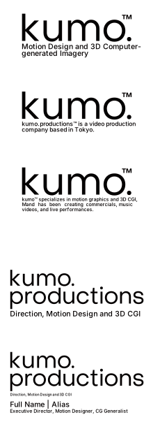
The logotype can be combined with text to bring names, departments, or systems into the identity. Pair Logotype TERTIARY or Logotype ABBREVIATION with Helvetica Now Display, following the examples below.

These are examples of combining the symbol with type. CENTRAL combined with PRIMARY is the most basic form, but feel free to recompose them to suit the design, purpose, and medium.

Logo and typography system
Logo & typography systemLogotype TERTIARY / Logotype ABBREVIATION / Helvetica Now Display (names are placeholders)
Logo symbol and type system lockups
Logo symbol & type systemCENTRAL / PRIMARY

Color Style Guidelines

09

Color Style

Color palette

These colors are elements that establish the kumo.productions™ identity.

To match the symbol — a cloud and its gathering of water droplets — each is a special color drawn from the image of the sky.

Never alter their lightness, saturation, or hue, and always apply them as flat, uniform fills. Follow the pairing rules described later.

Semantic colors — Extension

Role-based aliases for the seven base colors. UI and production work should reference these as a rule (defined in tokens/colors.css). The usage rules for the two highlight colors — never on gray, never in low contrast — apply at the semantic layer as well.

TokenSourceUsage
--surface-page / --surface-cardBase white #FFFFFFPage and card background
--surface-sunkenCloud white #F7F7F7Sunken surfaces, hover background
--surface-inverseSpace black #1E1E1EDark surfaces, inverse cards
--text-primaryBase black #000000Body text and headings
--text-secondaryCloudiness gray #6A6E71Secondary text, labels, captions
--text-inverse / --text-on-accentBase white #FFFFFFText on inverse and accent surfaces
--accentNight sky blue #1E4B6BLinks, emphasized actions
--accent-softSky blue #64ADD4Hover and focus emphasis
--accent-soft-bgSky blue 14%Selection and highlight background
--border-default / --border-strong#E9EAEB / #C9CCCE (derived from gray)Hairline dividers / input and outline borders
--focus-ringSky blue 55%Focus ring (2px)
--scrimSpace black 50%Modal and overlay scrim
--danger / --danger-bgoklch(0.5 0.13 25) — additional colorErrors, destructive actions (off-brand, minimal use)
--success / --success-bgoklch(0.55 0.1 155) — additional colorSuccess states (off-brand, minimal use)
--warning / --warning-bgoklch(0.58 0.12 80) — additional colorWarnings (off-brand, minimal use)
colors.css ↓

Color Style Guidelines

10

Color Combinations

Color pairings

These are pairing examples within the kumo.productions™ color system.

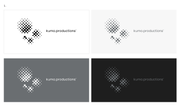
Approved monochrome combinations
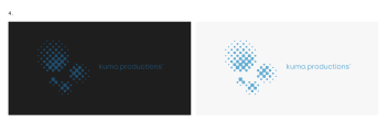
1. Basic pairings built around different base colors. Use these by default unless there is a specific intent.
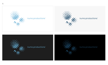
Approved highlight combinations
2. Special pairings using the highlight colors. Use these when you specifically want to attract attention or guide the eye.

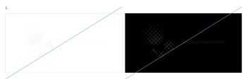
Incorrect usage

These are prohibitions and cautions within the kumo.productions™ color system, defined to avoid unintentionally damaging the identity. Beyond the examples below, any treatment that significantly damages the brand identity is prohibited.
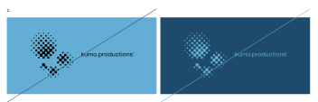
Incorrect: low contrast tone on tone
1. Do not pair colors that belong to the same group.
Incorrect: on highlight backgrounds
2. Using a highlight color as a background is prohibited.
Incorrect: highlight colors on Cloudiness gray
3. Cloudiness grayWhen Cloudiness gray is the background, do not combine it with the highlights.
Incorrect: low contrast highlight pairings
4. Even across different groups, pairing colors of similar tone can create unintended impressions — use with caution.

Usage Examples

11

Usage Examples

Applications (names and contact details are placeholders)

On-screen

16:9 end card
16:9
Cinemascope end card
CINEMASCOPE
SPHERES circular icon
SPHERES — icon

Print

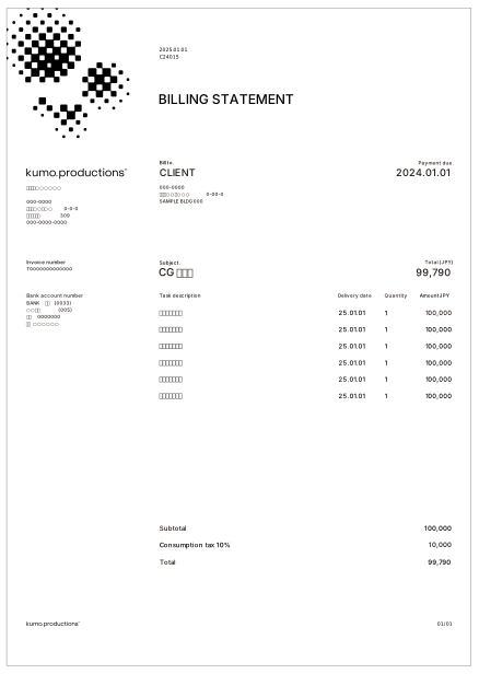
Billing statement example
Billing Statement
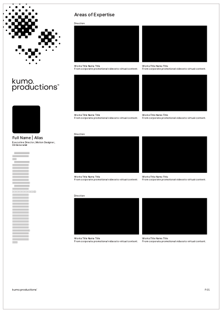
Resume example
Resume
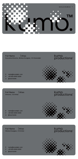
Business cards example
Business cards
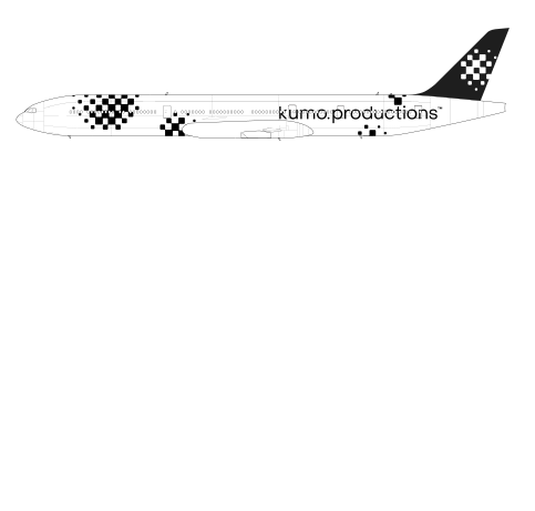
Aircraft livery example
Aircraft livery
Billing Statement — full text (placeholder copy)
2025.01.01 / C24015
BILLING STATEMENT
Bill to. CLIENT — Payment due. 2024.01.01
000-0000 0-00-0 SAMPLE BLDG 000
000-0000 0-0-0 000 / 000-0000-0000
Invoice number T0000000000000
Subject. CG — Total.(JPY) 99,790
Bank account number BANK (0000) (000) 0000000
発行元: 合同会社○○○○○○ 東京都○○区○○ サンプルビル 000
宛先住所: 東京都○○区○○○ 0-00-0 SAMPLE BLDG 000
Task description デザイン製作費 / Delivery date 25.01.01 / Quantity 1 / Amount(JPY) 100,000(×6行)
Subject. CG デザイン制作費 / 銀行 ○○支店 普通 0000000(口座名義はダミー)
Subtotal 100,000 / Consumption tax 10% 10,000 / Total 99,790
kumo.productions / 01/01
Resume — full text (placeholder copy)
Areas of Expertise
Direction(×3)
Works Title Name Title(×8)
From corporate promotional videos to virtual content.(×8)
Full Name | Alias
Executive Director, Motion Designer, CG Generalist
本文ダミーテキスト: 「ある日の暮方の事である。…」(芥川龍之介『羅生門』冒頭)
kumo.productions / P.01
Business cards — full text (placeholder copy)
kumo.productions/ →
Full Name | Alias — Executive Director, Motion Designer, CG Generalist
Full Name | Alias — Director, CG Artist
Full Name | Alias — Motion Designer, CG Artist
E name@kumo.productions
P +81 000.0000.0000
X @username

Design System Extension

12

Design Tokens

CSS tokens derived from the brand rules — styles.css imports tokens/colors, typography, and spacing

Semantic colors — full definitions in Color Style

--surface-page / card--surface-sunken--surface-inverse--text-primary--text-secondary--border-strong--accent--accent-soft / focus

Spacing — grid unit a = 4px

--space-1…16 (4→64px)

Radius / Elevation / Motion

--radius-sm 4 / -md 6 / -lg 10 (radii echo the particle R=2a)
Dividers are 1px hairlines. Shadows are limited to --shadow-card (very light) and --shadow-overlay
--dur 150ms / --ease cubic-bezier(0.2, 0, 0, 1)
focus ring: 2px rgba(100,173,212,.55)

Files

styles.css → tokens/colors.css / tokens/typography.css / tokens/spacing.css
assets/svg/(ロゴ・シンボル)
styles.css ↓

Dark mode

<html data-theme="dark"> flips every semantic token. The ground becomes Space black, text Base white, and the accent Sky blue (Night sky blue lacks contrast on black, in line with the prohibited pairings). Solid controls (--solid / --on-solid) swap black and white.

--surface-page #1E1E1E--surface-sunken #000--text-primary / --solid #FFF--text-secondary #9BA0A3--accent #64ADD4
Actions — light
Actions — dark(?theme=dark)
Forms — dark
Feedback — dark

Design System Extension

13

UI Components

A standard UI set built on the brand rules (React + token references). Live demos below — try them. Each component ships as a .jsx implementation, a .d.ts prop contract, and a .prompt.md usage guide

Actions — Button / IconButtoncomponents/actions/
Forms — Input / Select / Checkbox / Radio / Switchcomponents/forms/
Display — Card / Badge / Tag / KumoLogocomponents/display/
Navigation — Tabscomponents/navigation/
Feedback — Dialog / Toast / Tooltipcomponents/feedback/

Colors and states follow the guidelines: primary = Base black, accent = Night sky blue, focus ring = Sky blue, hairline-based dividers, and restrained 150ms motion. The state colors (--success / --warning / --danger) are additions required by UI, chosen as oklch values that harmonize with the palette (minimal use).